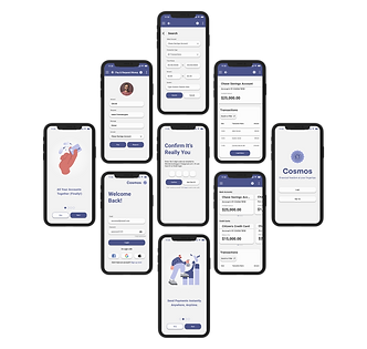
Cosmos
Responsive Web App
Cosmos is an integrated banking app designed to recognize users' need to manage accounts from various institutions on one platform.
Problem Statement
Possible Solution
Users need a way to remotely and securely access various bank accounts, transfer money, and shop in foreign currencies because they are busy with multiple bank accounts and credit cards.
Develop an app that consolidates bank accounts and credit cards, facilitates fast money transfers and payments, offers foreign currency exchange without fees, and provides financial literacy features.
We will know this to be true when we see users using Cosmos to transfer money to friends, to pay for goods and services in foreign currencies, and to track their spending across various accounts.
Project Requirements
8 Month Timeline
Mobile First Design
UI Design, UX Design, UX Research

.png)
Design Process
-
Competitive Analysis
-
SWOT Analysis
-
User Research
-
User Personas
-
User Journey Mapping
-
User Flows
-
Site Map
-
Card Sorts
-
Information Architecture
-
Wireframes
-
Prototype
-
Final Design Visuals
-
Feedback
-
Iterations
-
Reflections
01. Discover
I evaluated industry leaders in peer-to-peer payment applications to uncover expectations and identify industry trends. This allows me to create a differentiated experience that targets market gaps. I also conducted user research with our target audience to get tangible insights into user needs, goals, and pain points. All of this intelligence creates a comprehensive base upon which to build the startup's comprehensive mobile experience.
Competitive Analysis
Integrates a social feed, appealing to the modern fixation with media and convenience, to set itself apart from competitors in the market.
Accessible design and the network effect make Venmo a top financial app competitor.
The referral loop and social pressure enable Venmo to grow through word of mouth.
Outside marketing campaigns further encourage referrals on social media. Campaigns like "Blank Me" drive conversation, relevance, and brand recognition.
The social features that make Venmo so iconic are also the source of perhaps the app's main weakness: security concerns.
Diverse feature expansions and services that provide a unique market advantage.
Intuitive interface and peer-to-peer payment style facilitate new user acquisition .
Effective performance marketing on social media.
Security concerns, lack of customer support, non-global model, and competition threaten Cash App. Growth opportunities are still available through strengthening these weaknesses.
Focus on branding to create stronger customer loyalty and brand recognition.
SWOT Analysis
Venmo
Strengths:
A user-friendly interface with intuitive features is accessible to a diverse array of user groups. Social features make Venmo stand out from the competition by melding finance and media.
Weaknesses:
Social feature raises privacy concerns for those who want their finances to remain private.
Opportunities
Venmo can grow to offer more options such as budgeting programs, access to bank accounts withinthe app a credit score tracker, or foreign banking and currency options.
Threats:
Venmo faces competition from established competitors as well as emerging startup Fintech companies. As the market becomes more saturated it may be more difficult to acquire new users.
S
O
W
T
Cash App
Strengths:
Peer-to-peer payment apps with a sleek and simple interface are easy for users to navigate and in high demand. Diversification of financial resources creates an all-in-one finance app.
Weaknesses:
Limited international availability. Security concerns related to incidents of fraud. Users report difficulties reaching support representatives and resolving issues promptly.
Opportunities:
Opportunities to further expand lay in the realm or foreign transactions and financial education.
Threats:
Competition from other peer-to-peer payment apps and new up-and-coming apps is an ever-present threat to Cash App. Security breaches are potential concerns as they would violate user safety and trust.
S
O
W
T
User Research
To better understand the needs of our users, I interviewed three people between the ages of twenty-five and sixty.
My interview script was guided by these three key research goals:
Identify User Needs and Goals.
1
2
Identify pain points and areas for improvement in competitor apps.
3
High Level Takeaways
-
Participants already use online banking and finance apps as their primary mode of banking.
-
Participants want their mobile banking to be more comprehensive within one platform.
-
There is room for improvement with integrated features that already exist in banking apps, particularly with the setup of additional features and the readability of things like transaction history and credit score.
-
There is also an opportunity to integrate new features that users do not have access to currently, such as applying for loans and foreign currency exchange.
-
Users have similar pain points, goals, and habits regardless of age range and demographic.
Affinity Map
I organized my findings from the research I conducted in person using sticky notes to categorize my findings.
This diagram is a visual of my data analysis patterns.
Common Usage
Use Mobile Apps for Banking
Challanges
Balancing Security and Convenience
App Specific Problems
Managing Multiple Accounts
Future Needs
Integrated Features
Improved Setup for Additional Services
Improved Foreign Transaction Features
Credit Card Features
Credit Score Tracking
Budgeting
Lack of Budgeting Tools and Knowledge
Security and Convenience
Benefits for International Travel
Understanding Financial Details
02. Define
I created user personas based on the target audience and my user research. These characters, who represent the larger user base of the website, act as the North Star to guide my team throughout the project. I also fleshed out user journey maps based on Aiden and Maria to get the ball rolling for later stages, where I will work on site structure and information architecture.
User Personas

Click image to expand.

Click image to expand.
User Journey Mapping
Aiden & Peer-to-Peer Payment:
Click the images below to expand.
.png)
.png)
03. Ideate
Ideate. Create. Generate. Brainstorm. In this stage, I come up with potential solutions to the problem without judgment. Site architecture and navigation begin to take form throughout various revisions and iterations, informed by real user feedback.
User Flows
.png)
Pay Credit Card
User Flow for Credit Card Payment. Click image to expand.
.png)
Peer-to-Peer Payment
User Flow for Peer-to-Peer Payment. Click image to expand.
User Flow for Payment History Search. Click image to expand.
.png)
Card Sort and Information Architecture
I conducted an open card sort with five participants with twenty-seven cards correlating to the different anticipated areas of Cosmos.
By understanding how people categorize information, we create a foundation for robust information architecture and enable ourselves to build a navigation system that matches user expectations.
Results: Dendogram

A Dendogram is a visual representation of how participants grouped items during the card sorting exercise, essentially showing a hierarchical clustering of the cards based on how often they were placed together by users, helping to identify natural groupings and inform information architecture decisions within a website or application.
Cards are listed down the left-hand side of each dendrogram, while the axis along the top measures the level of agreement across participants. Clusters closer to the left indicate that more participants agreed with this grouping.
Results: Similarity Matrix
-
The similarity matrix helps identify strong card pairings and potential groupings in open card sorts.
-
Pay, Transfer, and Deposit were grouped by 100% of the participants.
-
Request was grouped with the three previous cards 80% of the time.
-
Accounts and Profiles were also grouped by 100% of participants, which is understandable but contrary to the initial site map, where Accounts mean bank accounts, not user accounts.
-
Exchange Rates and Credit Scores were grouped by 60% of users, which I believe to be a powerful result without context since these are the secondary functions of the app.
-
Add New Account and Search / Filter were the cards that were placed with the largest variety and inconsistency.

Results: Tab Grouping and Naming
Below are some key takeaways from the card sort with visual representations of three users' results.
Credit Scores and Exchange Rates were often grouped under titles like Money, Actions, or Additional Info, which was an association I was hoping for.
Sometimes cards like Pay, Request, Transfer, and Deposit were lumped in under the umbrella title Actions, which makes sense. These cards were always sorted near each other but could be organized in a myriad of ways such as into groups Options or Transactions.
Pages and User Portal groups were very similar and also overlapped with User; containing cards such as Home Page, Accounts, Profile, and Personal Information. The only surprise for me was to see accounts included, but I realize this is because of vague language. I should label these Bank Accounts so it does not get confused as User Accounts.
Footer, Help Center, Help, Options, and User were the remaining categories with the most confusion. Most of the cards within relate to Settings, with a few outliers like Transaction History and Credit Score.
Site Map
Information architecture is the art of organizing the pieces of a whole in a way that is easily comprehensible.
Our goal was to arrange Cosmo's content based on our card sort analytics so that users can easily navigate the functionality of our product.
Based on our findings, we use information architecture to build an intuitive and navigable site map.
.png)
04. Design
Wireframes for Peer-to-Peer Payment Flow
Three iterations of wireframes for the peer-to-peer payment flow, moving from low to high-fidelity.
More flows and desktop/larger screen formats of these flows can be viewed in Figma.
.png)
Home Page
Pay/Request Input
Pay/Request
Authentication
Success
Peer-to-Peer Payment Low-Fidelity Wireframe; a rough sketch focusing on basic layout and functionality.
.png)
Pay/Request
Peer-to-Peer Payment Mid-Fidelity Wireframe; a little more detail, first touch of UI.
Home Page
Pay/Request Input
Authentication
Success
.png)
Success
Authentication
Home Page
Peer-to-Peer Payment High-Fidelity Wireframe; refined design elements and interactions ready for testing.
Pay/Request Input
05. Testing
Usability Testing
Time for testing! We recruited 5 participants to participate in moderated in-person usability tests of both our mobile and desktop prototypes. These are our findings.
Goals:
1. Identify User Pain Points: To uncover areas where users experience frustration, confusion, or difficulty while using the app.
2. Ensure Task Efficiency: To test how quickly and easily users can complete the three tasks within the app. This ensures the app is intuitive and minimizes unnecessary steps.
3. Validate User Satisfaction: Assess users' overall satisfaction with the app's design, navigation, and functionality. Positive feedback helps confirm that the app meets user needs, while negative feedback guides areas for improvement.
Test Objectives:
1. Navigation – Testing how easily new users can navigate the app, find information, and understand the structure.
2. Peer-to-Peer Payment- Initiating an instant payment or request of funds to another person via name or phone number.
3. Transfer Funds- Completing a transfer of funds between two bank accounts within the app.
4. Search Transaction History: View transaction history and search for specific transactions by enabling filters.
Check out the comprehensive
from start to finish!
Affinity Map
I utilized an affinity map to organize test results into four major themes that could guide actionable takeways.
.png)
Priority Revisions
1. Create an alternative navigation path to the transaction history by clicking on account cards.
2. Add a return to home or exit button in the top right corner of the page in pay/request and transfer screens to minimize the number of clicks and allow users to quickly leave the page.
3. Add a scan barcode option for mobile to make it easier to search recipients. Add a recent or favorite recipient option to expedite the pay/request process where the user is paying someone frequently.
4. Add an “all accounts” filter within the different account options for transaction history.
06. Design (Again!)
The design process is not always linear. After testing, I iterate on my designs until I have solved user problems and achieved the project goals. These are my final design visuals and reflections, the coalescence of the entire design process.
Some Iterations
Updated header according to Material Design 3 Guidelines
Lacking back arrow/exit navigation
.png)
.png)


ITERATE
Unclear user input for selection
Improved dropdown menu for recipient selection with QR code and suggestions based on algorithm
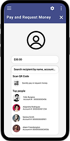
Final Design Visuals
My final design visuals were created over time in response to the results from user testing. They also underwent numerous rounds of iterations based on additional factors such as peer review, accessibility guideline testing, and internal feedback from my team. Some imperative changes include:
-
Updated header according to Material Design 3 guidelines.
-
Improved iconography sizing for enhanced UI and accessibility.
-
Added exit and return buttons for smoother navigation.
-
New dropdown menu for peer-to-peer payment, offering users a variety of options for recipient selection.
-
Labeled form fields to meet WCAG accessibility guidelines and provide clarity.
-
Restructured spacing to decrease cognitive load for users.
-
Integrated subtle animations according to brand identity to imbue design with playful energy.

To check out the entire collection of Cosmos design visuals, visit the
Thank You! Want to See More?
Check Out My Other Work

UX/UI Design
